top of page


Apes Love Hypecraft Title Sequence
Project Role : Art Direction, Animation, Design
CONTEXT
Apes Love Hypercraft is a television show for children to learn about craft, digital and related media that is showcased on Channel 8 and the Toggle app required a title sequence that brings together all the elements of the show. It is hosted by an unconventional mascot - Kim Kong, who is fast-talking, free-styling primate.
CHALLENGE
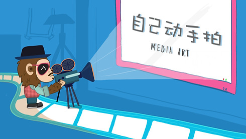
The title sequence consists of six segments. Light Mania, Creative Tech, Maker Showcase, Media Art, Super Smart Craft, and Munchkins which had to have elements that linked to each theme. As the main audience for this show were kids, the visual language should revolve around everyday objects that are relatable to them. Color usage had to also be bright, cheerful, saturated to appeal and attract the younger audiences attention to the elements, and to complement the visuals further.
EXECUTION
As Kim Kong is the mascot of the show, we introduce him throughout the various segments of the title sequence to align with the overall theme of the show where he is represented as the host. Explorations were done to create visuals where the mascot interacts with elements representative of each segment.
Initial Storyboard Explorations

Initial Styleframes Exploration


1/1
Title Design Iterations

The initial color choices for the title design produced legibility issues and colors were not complementary of each other. The color choices were narrowed down and a blue color is used for the table that is calmer to signify the ending of this title sequence, as opposed to the color explosion of the visuals before this. The typography for the title had a 3D feel to it while maintaining its playful through its paper cutout look and introducing a play with scale and angles to not make the title appear too rigid.
Finalised Storyboards

Instead of a vectorized approach to the elements, the approach to the design formerly felt too rigid and did not really fit the theme of the show, where it encourages children to be more hands-on. With this in mind, the design creation process was altered where I would go for a more traditional hand-drawn aesthetic to the visuals. Most of them were reworked, to better suggest each respective scenes much more literally to ensure that the audience will get the message behind the visuals right away while still retaining the playful approach to the animation. I also introduced English that directly translates the Chinese supers for the non- Chinese audience that would like to watch the show despite the language barrier.
Finalised Styleframes


You may also like


bottom of page